

Creo crafts premium chocolates but its packaging didn’t stand out or communicate the quality of the product. Creo needed a packaging redesign to communicate its premium positioning.
Creo crafts premium chocolates but its packaging didn’t stand out or communicate the quality of the product. Creo needed a packaging redesign to communicate its premium positioning.
When years of mergers leave a brand looking like it was designed by committee it was clear that GlobalSpec needed some help. The time was right to stop patching and start building. So we went back to brand’s core elements and rebuilt it from the ground up and gave IEEE GlobalSpec the unified identity its engineering audience always deserved.
Hair loss is emotional. Hair restoration is clinical. Athens Hair Transplants needed to enter an established market and make a strong first impression built on trust and renewed confidence. The Athens brand is built on the foundation that Athens will be your partner every step of the way on your path to renewed confidence.
At Milan Laser, we remove what doesn’t belong (goodbye unwated hair!) and celebrate what does. When our new headquarters didn’t reflect the Milan brand energy, pride, and conviction, we sprinkled some “Milan Magic” and applied culture straight onto the walls. What started as a blank corporate interior became a bold expression of who we are and the values we live by every day.
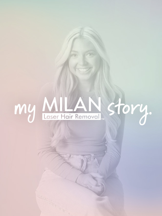
Milan needed a way to tell its story without sounding like it was selling. The most credible voice wasn’t the brand, it was the people whose lives had actually changed. My Milan Story was built to let real customers do the talking and prove, in their own words, what permanent results really mean.
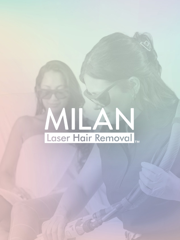
In a category crowded with aspirational promises and luxury posturing, authenticity is the real differentiator. Milan Laser doesn’t rely on a Vibe. Rather, it delivers results. Permanently smooth skin, backed by medical expertise and an unlimited treatment model, delivered by brand that’s honest and effective. This rebrand was about aligning the execution with the experience and building a brand expression that earns trust by delivering exactly what it promises.
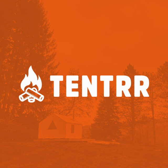
In the ever-evolving travel platform landscape, Tentrr a pioneering Airbnb-style campsite company needed help reaching their audience through social channels to tell their story and help more people experience outdoor getaways. With a portfolio of breathtaking campsites rivaling their urban counterparts, the company faces a challenge – bridging the gap between wanderlust and awareness. To propel their brand and campsite experience forward and forge deeper connections, a tailored social media and email strategy served as the compass guiding their customers to unplug and reconnect.
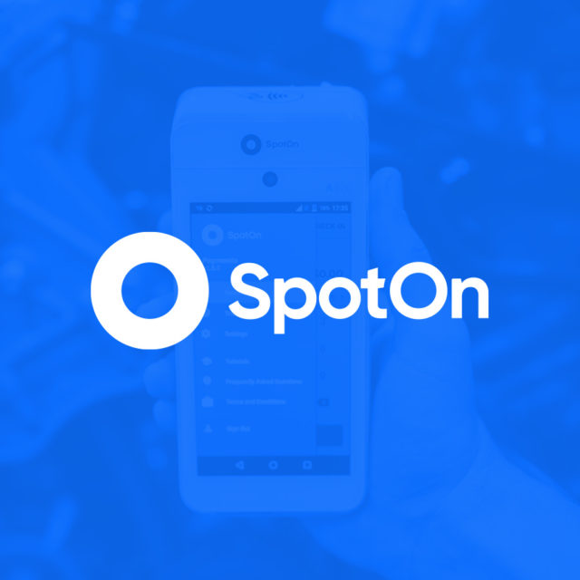
In the bustling realm of small business solutions, our client, a leading hardware and software point-of-sale provider, aspires to empower growth for enterprises. Amid fierce competition, a pivotal need arises to not only offer cutting-edge technology but also to forge deeper connections through strategic content.
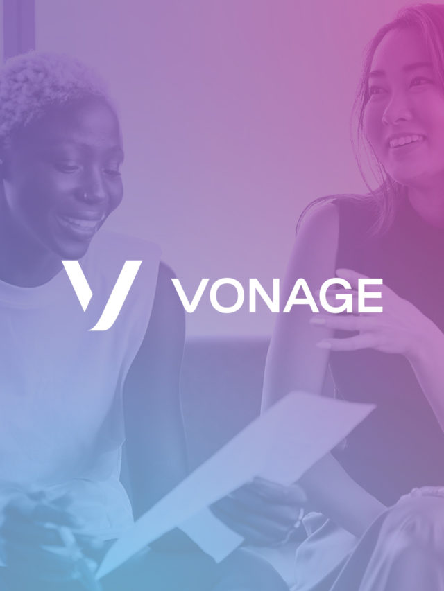
In the dynamic realm of modern marketing, brands need tailored narratives that seamlessly intertwine their strategic offerings into the lives of their customers. This strategy isn’t unique but it can have novel outcomes and surprising results. Vonage needed just that. Specialized business telecommunication content developed to seamlessly integrate with content to position Vonage – naturally in front of their customers in a way that would resonate long after the scroll.
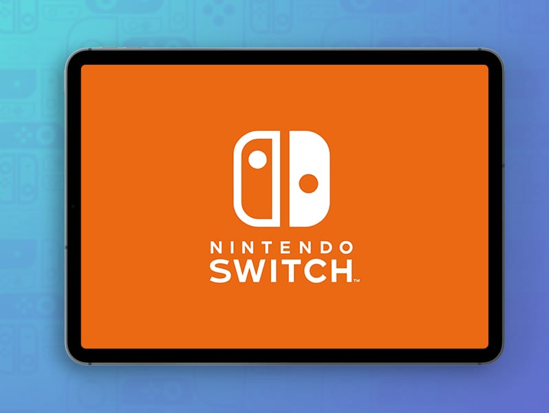
This Nintendo Switch parental control tablet app redesign (concept) was undertaken to give Switch® users a better understanding of their Switch usage data. To give them the ability to make smarter decisions about screen-time for themselves and for the next generation of gamers.
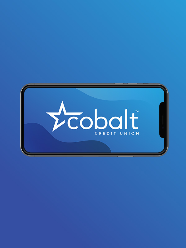
In the ever-evolving landscape of modern finance, digital banking applications have become the cornerstone of customer interactions with financial institutions. As technology advances and customer expectations evolve, the need to reimagine and redesign these apps becomes crucial. This case study is a Credit Union banking app redesign with the goal of enhanced user experience and application of the brand expression.
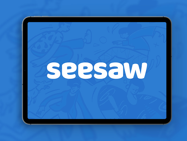
This mobile teaching app was a redesign (concept) I approached to increase parent-teacher interaction with young learners to increase engagement and retention of the curriculum.
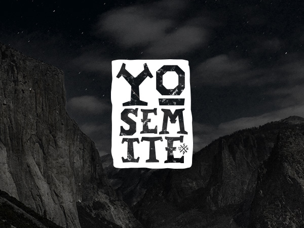
Yosemite National Park and Yosemite Hospitality needed a new logo. Great. But when you work on a logo that will be featured in one of the preeminent national parks, you need to be very delicate be to ensure that you look to future with an eye on the the past. The new logo needed to feel traditional. It needed to work in a number applications and speak to the history, natural beauty and immensity of the park. And above all it needed to match the epicness that is Yosemite.

Running Y Ranch Resort offered a premium resort escape for those looking for an elevated and relaxed experience, but its existing brand was telling a different story. This rebrand flipped the script and closed the gap between expectations and the experience.