

One of my favorite aspects of working in advertising is the creative process. Pretty much…
One of my favorite aspects of working in advertising is the creative process. Pretty much…
A few summers back, the creative team at RIESTER was tasked with the development of…

I was asked by a professional colleague to assist their design conference by developing a…
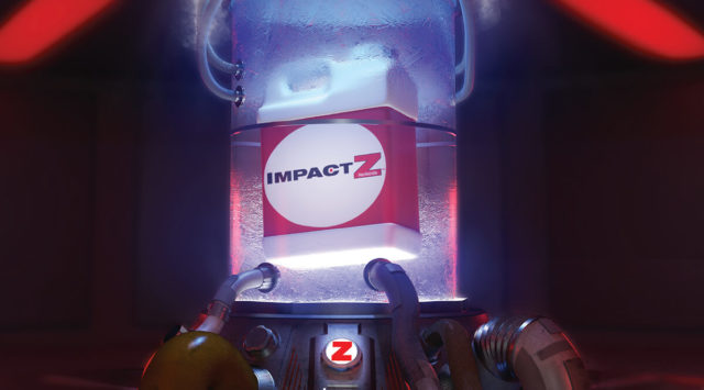
I was recently tasked with working with a team on developing some print concepts for…
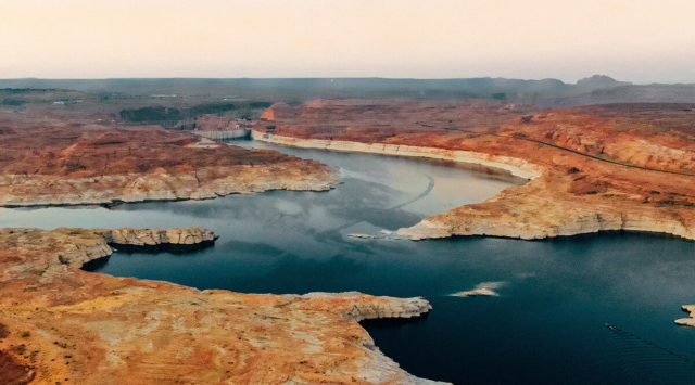
A few years back I moved to Arizona. One of the first things I did…
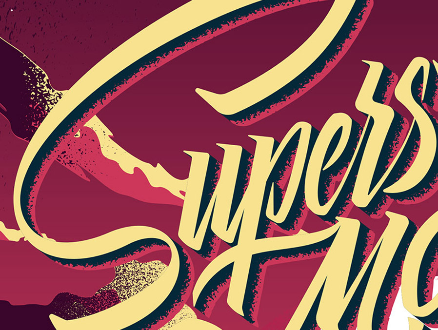
I’m a native Nevadan and graduate of the University of Nevada. This means that each…
A set of hand lettered and illustrated skate decks with good advice. Listen to these…