


I was asked by a professional colleague to assist their design conference by developing a typeface to both commemorate and be used in the design conference called DICE. This year’s DICE theme is ADAPT and for this, they wanted to develop a custom, geometric, display typeface that could be given away to attendees of the conference based on historical De Stijl, Bau Haus, and Avant Garde designs such as Architype Van Doesburg or the typography developed by Pentagram for the Parsons New school of Design.

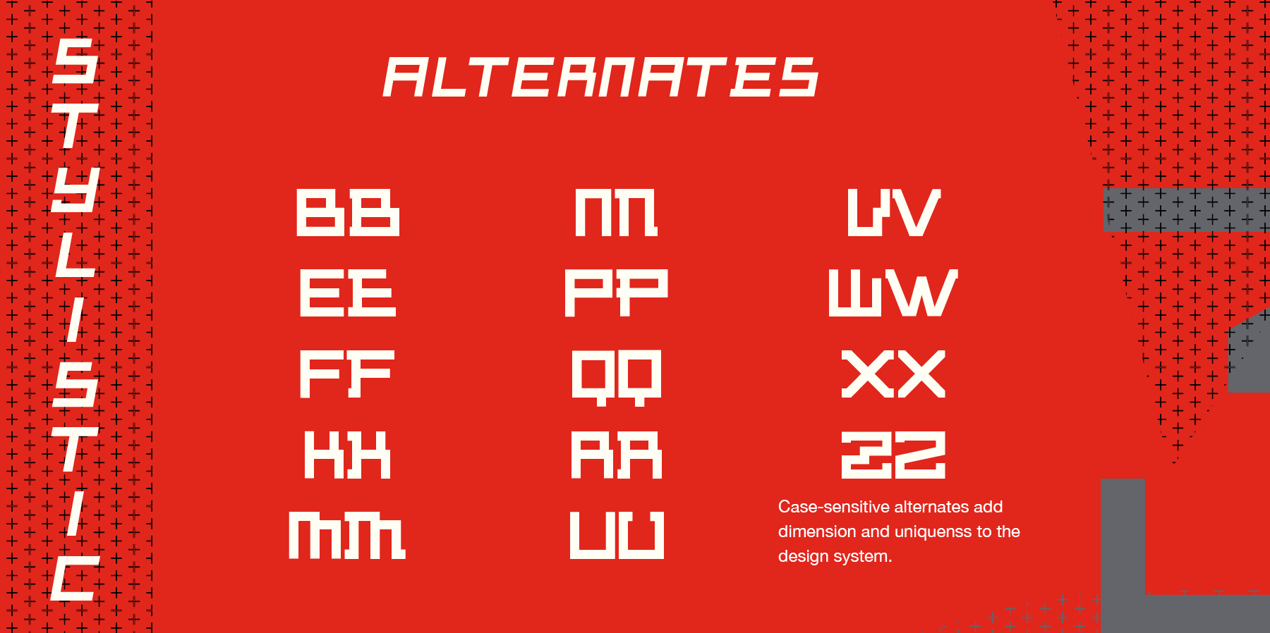

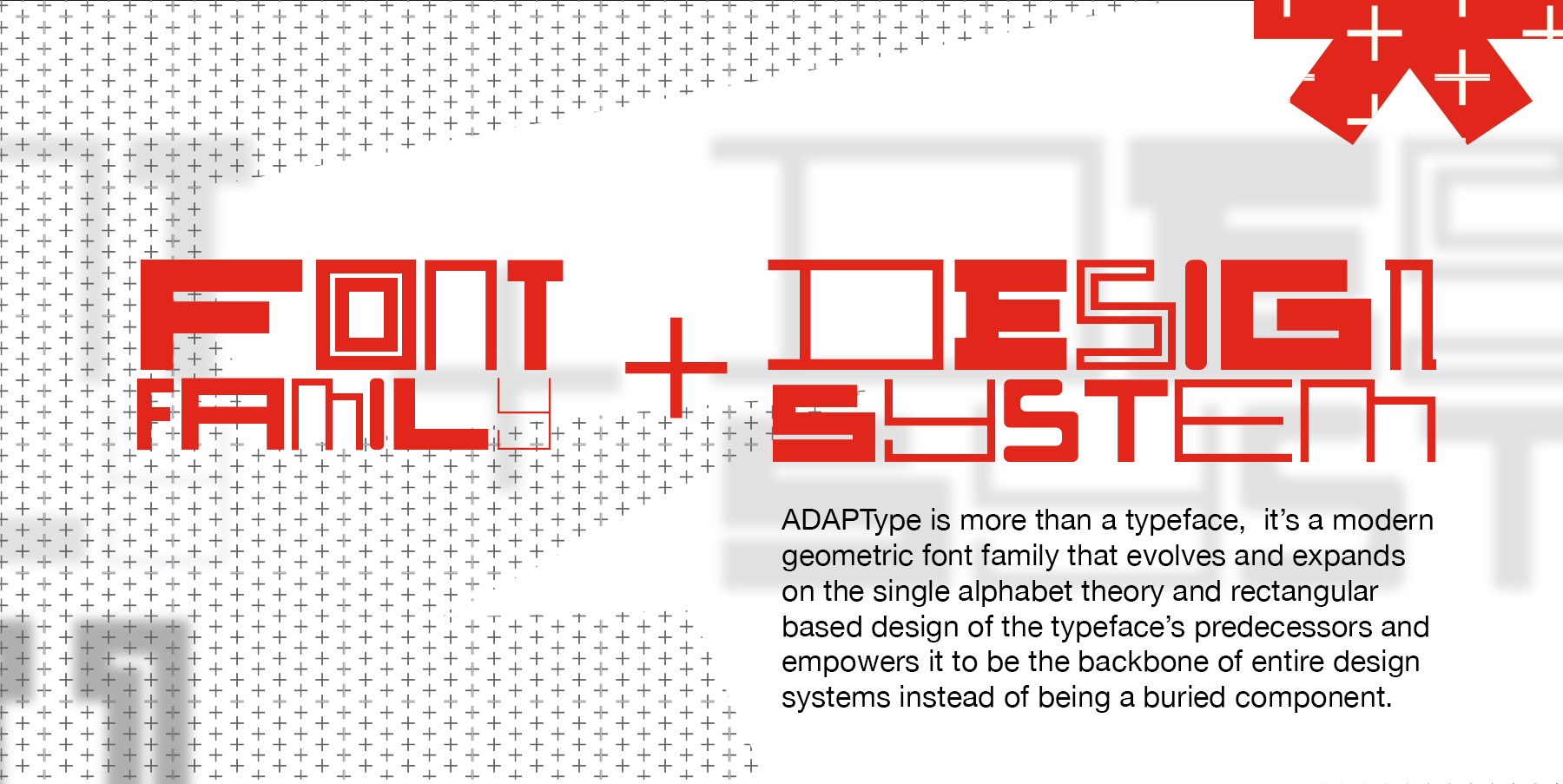
I was supplied with four letters A,D,A,P and T, and from there I developed an initial alphabet of letters based on a grid design that expanded on my initial character set. I was able to develop the initial 5 typefaces that were suggested, but it really didn’t have the flexibility that I would want from a typeface like this. So I got back to the drawing board and developed a total of 15 typefaces of varying weights and widths to really flesh out the font family, including numerals, punctuation, and case-sensitive alternates.
The end result is a display typeface with historical context but forward-thinking in mind to tackle modern design projects. The full font family with 15 faces in 4 weights will be available to purchase after September 30 online through my online store here. For a sample of the font family, you can purchase tickets to the DICE conference online here.