

Objective
Design packaging for Creo’s chocolate bar line that aligns the packaging experience with the premium ingredients and stands out in the crowded artisanal chocolates retail landscape.
Problem
- Creo’s chocolate bar packaging blended into the competition on the shelf, it was drowning in the sea of similar products, giving shoppers no visual reason to stop and engage with the brand.
- The existing packaging also failed to clearly communicate what makes Creo exceptional: handcrafted chocolate made with premium, organically grown Ecuadorian cacao from a single family farm. This is the primary differentiator and it was getting lost.
The Insight
The old packaging communicated “handmade” in the wrong ways. From parchment backgrounds and mismatched ribbon accents, the crowded layout pulled in too many directions and was giving “craft-fair” instead of premium. Making the origin, culture, flora, and fauna of Ecuador the centerpiece of the centerpiece of the packaging story gave a clear creative direction, a unified visual identity, and a narrative worthy of the ingredient that makes Creo worth choosing over anything else on the shelf.

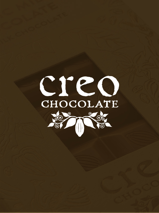
Solution
A new packaging system built entirely around the source of Creo’s chocolate. Where the old design leaned on aged parchment textures and generic “craft” signifiers, the new direction makes a bold, immediate visual statement. A unified illustrated world of cocoa plants, flora, and fauna native to Ecuador communicates Creo’s key differentiator and story on every bar. This gives the full lineup of products a cohesive identity rooted in something unique and specific to Creo. Every bar shares the same visual language while remaining distinct AND consistent.
The illustration is applied using a hot-stamp gold foil treatment. The foil creates a premium, tactile and visual signal of quality the moment a customer’s eye lands on it, aligning the look of the product with its premium Ecuadorian ingredients and price point. The result is packaging that tells Creo’s story, communicates premium and aligns the full product line while standing out in the sea of sameness.


Process
- The first step in this process was to identify the one thing that makes Creo unique. For Creo, the reason to believe was their cacao source, a single family farm in Ecuador. This is their narrative and creative foundation for the redesign.
- Next I developed an illustration system drawing from Ecuadorian flora, fauna, and regional artistic aesthetic. This illustration gave each bar a distinct character while maintaining a cohesive premium visual language across the full bar line.
- I designed the color system for the full line up of products utilizing a hot-stamp gold foil treatment. This created a premium visual that tells the Creo story and signifies premium while standing out.


Results
- Brand recognition – The packaging now reflects the premium quality of the product AND tells the Creo Story.
- Unified Product Line – The new packaging unifies their entire line of chocolate bars.
- Brand momentum – The packaging design system is ready to serve as the platform for Creo caramels and sipping chocolates.