
Redesigning the logo for Yosemite National Park and its hospitality brand was both a fantastic opportunity and a huge challenge I was eager to take on. I spent many summers traveling to national parks throughout the West with my family in my youth and the memories from those trips are still etched in my mind. Having the opportunity to contribute the story Yosemite National Park’ tells to future generations was a huge honor. The redesign of the logo needed to be seen as a visual complement of the hospitality logo and stay true to the heritage of the park and its Half Dome logo. The goal was to continue to inspire the next generation of park visitors.

The Problem
The client needed a new logo for the national park that felt like an appropriate evolution from the previous Yosemite logo. The new logo needed to work across park entities, create a distinction from the iconic Half Dome logo, feature an icon of the park, evolve from the circle Half-Dome lgoo, and utilize existing colors from other park logos.
The solution
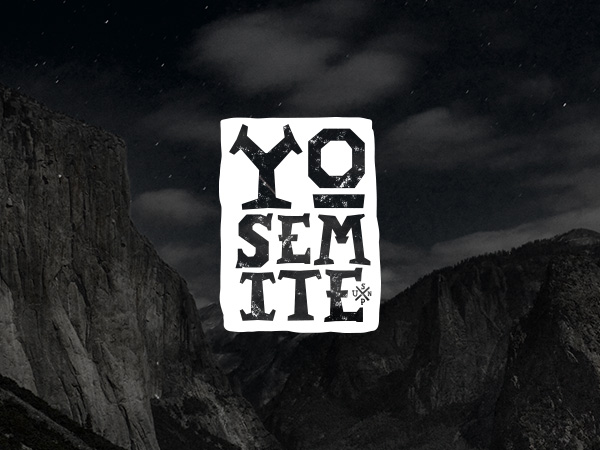
Through researching iconic geologic rock formations of Yosemite I selected El Capitan as the hero for the new park logo. I added detail to the rock face within the logo to make the formation more recognizable. I also determined that framing the rock formation inside of a square would highlight the rock formation and give it added impact when applied to layout, merchandise, and signage.

Through the design exploration process, I designed rounds of icons and explored many typefaces that highlighted the natural aspects of the park. I also wanted to feature a geologic formation other than Half Dome in the logo, to evolve the conversation that Yosemite is more than just one iconic geologic formation.
Exploration and evolution process

When compared side by side, the updated park logo is an obvious and intentional evolution. The redesign still features an iconic rock formation (El Capitan), bold line work that frames up El Cap (to give the mark heft), and subtle evolution to the color (nuanced and restrained). The new logo is distinctive and appropriate for a storied national park its informed by the past and looks to the future.

Design is so simple, that’s why it is so complicated.
– Paul Rand

I paired the icon with a contemporary slab serif typeface that communicated a balanced and crafted feel that feels outdoorsy but refined. I also referenced historical park logos for the color direction – but made subtle adjustments for a more nuanced/refined feel. Nearing compltion I also created a sister logo for the hospitality management group that manages park properties utilizing the same typography and visual elements to keep all park brand assets in the same design system but also distinctly its own.